a blog about me, my work and my influences

Thursday, 22 October 2009

research workshop.

Last friday I took part in a class/workshop with the title of 'Research'. It introduced ways of displaying primary research or data that you have collected in ways perhaps not like the norm, like words or graphs.
I came away from it with more ideas of presenting research in interesting and exciting ways.


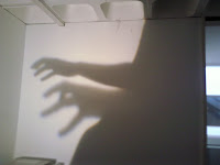
In the workshop we had to split into pairs and think of a question to collect data from. I originally had the question 'What is your biggest fear?'. But then we couldn't think of a really exciting way to present the answers we were getting so we had the idea of people projecting a shadow onto a wall of the most scary thing they could using their bodies.

It came up with some interesting sillouettes shown below, which could be presented much more interestingly.




Wednesday, 21 October 2009

tetris with skateboards.

Thought this was pretty cool


blogger.

I have to say positioning images in posts is so fiddly, especially when you have text too.
Any tips anyone? Ta

100 collages!

Kaayy, so we got set a project in the image workshop, (we were creating collages in short spaces of time on A6 paper), and I have to create 100 collages by December.

They have to be A6, landscape and everything must be cut out, you're not allowed to draw on them. There are ten themes and I must make 10 collages for each theme. It will hopefully look pretty cool when I've done them all.

Here are some pics of me making a mess at my girlfriends this weekend.


.
.


Wednesday, 14 October 2009

life.

How come David Attenborough is so awesome?

I watched the first episode of his new series Life on iplayer tonight. It's so good. WATCH

http://www.bbc.co.uk/iplayer/episode/b00ncr13/Life_Challenges_of_Life/

Tuesday, 13 October 2009

originals.

Here are some of the original images I cropped.


cropping sesh.

Last friday I did a cropping exercise on photoshop, where you took photos and then cropped them in certain ways to create a different meaning or enhance a particular aspect. These are my crops with a Postive, Minus and Interesting point beside them.

close up of detail.
P: It focuses in on a particular part of the photo, I like the way both of the kids hands are in the photo.

M: Doesn't show much detail i.e. not as detailed as it could have been.

I: The fence kind of shutters the goat out a bit, it looks like it's in the background.


wide angle horizontal.
P: The angle looks as though the viewer is following the cameramans view down the lens.

M: Doesn't show the angle very well.


I: I like the way it shows only the top halves of both people.


narrow angle vertical.

P: The way the angle follows the line of babies.

M: Not a great angle tbh.

I: The crop seems to draw your attention to the front baby, just like the focus on the photograph.


depersonalise a photo.
P: It makes you unable to know what he is doing.

M: Hard to depersonalise a photo with people.


I: It looks like he's about to get crushed.


crop to abstract


P: Follows
the strange shape of the sculpture in a cut-out way.

M: Not sure it really abstracts the photo.

I: The change of angle.


crop to define.

P: It draws attention away from the main part of the original photo. Defining! It brings the attention to this toy of the poor kids, because its a bit of a crappy doll, it shows what they have to play with and what living conditions they might be in.


M: It doesn't define a particular detail in the doll.


I: I find the doll quite interesting in itself, thats why I cropped it down. Althoug
h that isn't an interesting point about the crop.


make look distant.
P: I cropped down to just her face because it makes her look distant from everyone else in the crowd. She kind of looks in a world of her own and isn't paying attention to the hysteria around her, she's just focusing on Obama.

M: Not too exciting of a crop.

I: The expression on her face helped with making her look distant.


crop to enhance emotional impact.

P: It focuses in on the eyes which makes the viewer wonder what is wrong.


M: Could be a bit more impact.


I: The way that the viewer automatically knows the baby is crying even though not all the photo is there to see.


narrow vertical.


P: It focuses on what is behind this slightly sinister looking boy, and shows this devastation.

M: This is probably my favourite crop, so i don't know.


I: Just that the simplicity of the crop highlights so much behind him.


bold, exciting.
P: It shows an exciting action.

M: Not exactly very bold.


I: The framing of the boy and the goal.


discreet.
P: I think its discreet because you don't know who the people are or why they are together. Focuses on their contact.

M: A bit simple really.

I: Has a slight air of mystery around it.

own crop.

P: It removes the people from the surroundings and therefore is a bit like the depersonalise header, it removes the contexts of the original photo. You don't know what the people are doing or why they are doing it.

M: The cropping isn't perfect.

I: The way the viewer is in the dark as to whats really going on in the photo.

Friday, 9 October 2009

my neighbourhood.


I took this photo because I thought it represented the Elephant & Castle area. It shows an old block of flats and a new development and emphasises the change going on in and around the area. There is a lot of gentrification going on in E&C and it'll be interesting to see how the place changes throughout my time here.

Wednesday, 7 October 2009

the first post.

So yeah, this blog is basically a way for me to show, analyse and develop my work throughout my time as a graphic designer. I'll also use it for posting my thoughts, influences and just general bits of stuff I like.

It's kind of exciting and I hope it won't bore people too much. I'll get a more substantial post on here soon. x