It's pretty crazy how quick this year's gone and how much I've learnt. I've learnt better ways for collecting research, and recording it, learnt new things on software and loads of small things which have helped me develop my work..
I hope this book and poster I am doing at the moment will show how far I've come since last year before starting this course.. I feel my work has improved a lot, having people around you with ideas helps this. Some work has turned out better than others but this final project will hopefully show a lot of my skills as a graphic designer.
Looking forward to next year and cracking on with lots of new projects..
Thursday, 27 May 2010
Wednesday, 19 May 2010
Tuesday, 18 May 2010
workshop 4.
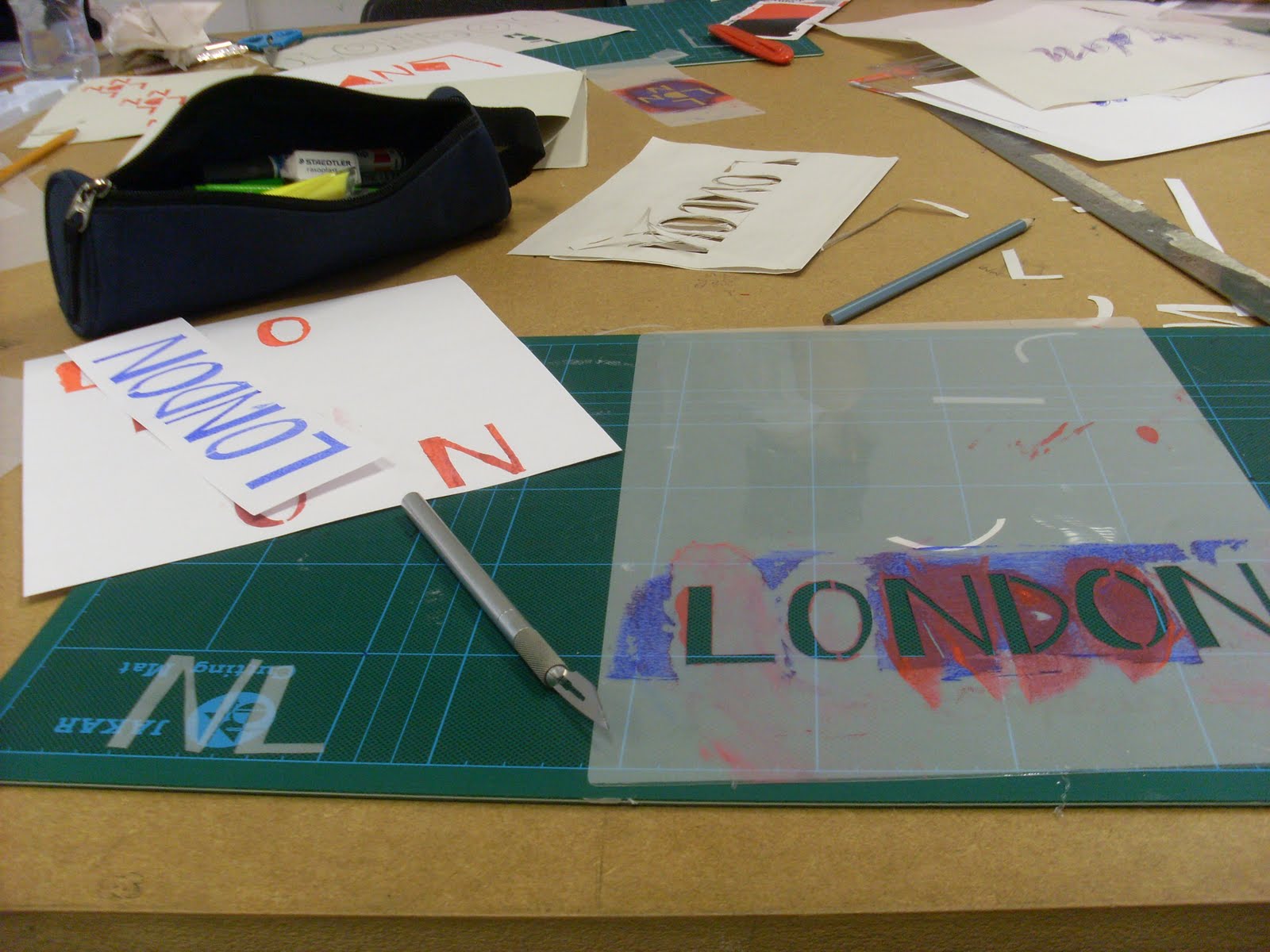
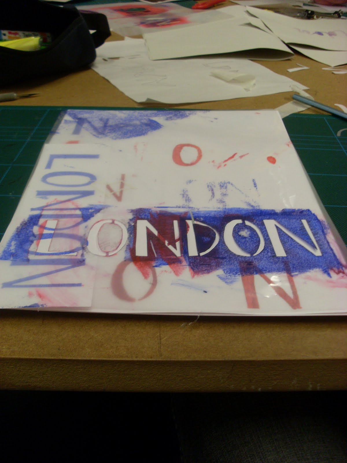
In this workshop everyone had to recreate a bit of London map using only type. Then when they were done paste them all together to create a large map of London. Simple. Everyone had a different style and technique of doing it so it turned out varied but looked pretty cool. We were only allowed to use Helvetica and Red.


Monday, 10 May 2010


apfelsaft.

Went for a studio visit to APFEL (A Practice For Everyday Life) the other week. Their work is quite typography based and so clean and well layed out. They've done work for Tate Britain among other things. It was a good insight into how a studio works and in run as well as how to start your own design studio up. It was good to look about and see in what kind of environment they work in as well as seeing some of their work.


Sunday, 9 May 2010

Thursday, 6 May 2010
coat.

of arms for Harrow which we based the snake idea from.
Might go to Harrow sometime for a bit of an extension to this workshop, and do something snakey. Would be fun.
workshop 2.
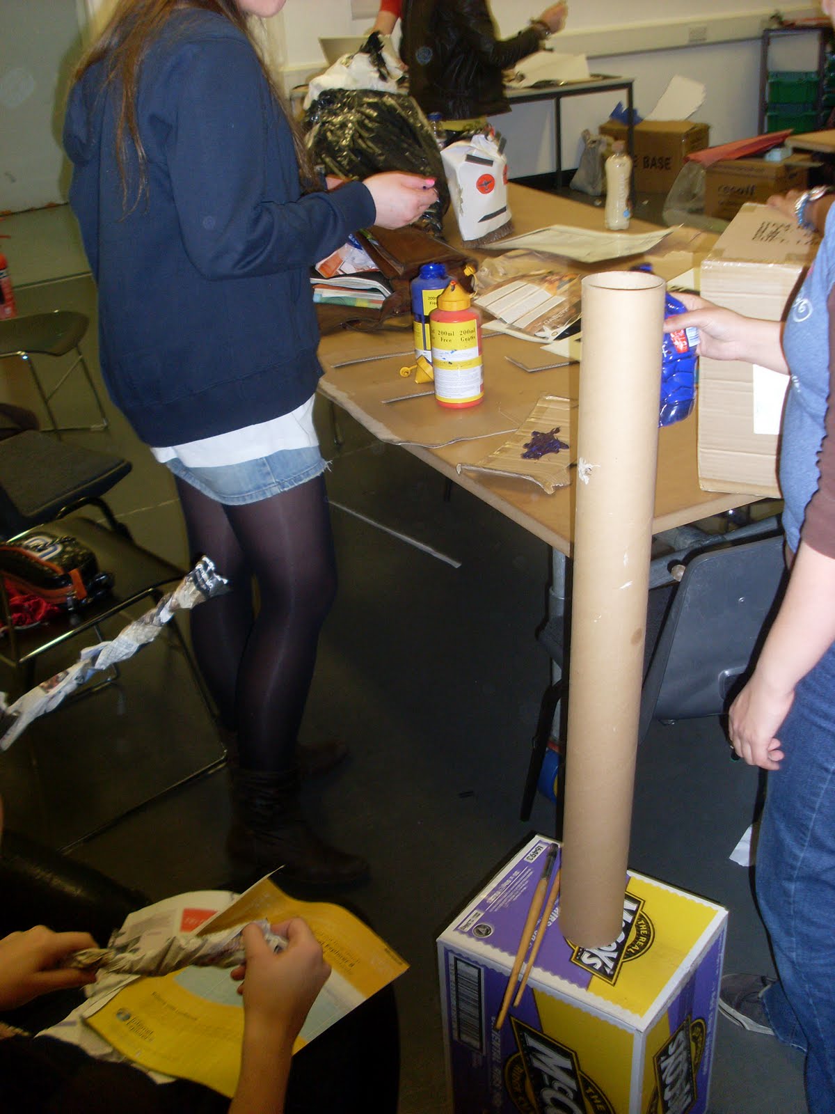
Workshop numero 2 was pretty fun, a more lighthearted workshop. We had to get into groups, pick a London borough, find a load of junk from around the college and then use said junk to create a creature/character that represented the particular borough.
Our group picked Harrow. Not sure why. No one really knew much about it, must have been intrigued. Or all the obvious boroughs had been used. Whatever.
Here is a picture or 2 of the pile of junk and card we found.

So after doing a little bit of research of Harrow we found the coat of arms and the fact that Harrow meant the word 'temple' in some language. So, being the smart graphic designers we are, we thought POW!! let's combine the two! The coat of arms contained a snake wrapped about a stick, which is a creature so we set about making a snake that lived in a temple with the cardboard boxes and rubbish we had.
Here are some photos of Harold being built and stuff. And him next to 'Louie' from Lewisham the chicken leg which another group made.


Subscribe to:
Posts (Atom)
