skip to main |
skip to sidebar
 This was my final poster design for the first hand in of our project. It might be changed a bit for the final hand it but I'm fairly pleased with it. The feedback included trying to display it more creatively so I'm going to think of different ways to do this.
This is the evaluation I wrote for my PDF.
"I am happy with the final layout and design of my poster. I feel it would appeal to my target audience due to the copy on it being thoughtful and the design being fairly simple and clean. The proverb I used is supposed to make the audience smile, but then also give a more thoughtful response.
"The design, I think could still be improved with more refining and experimentation with colour, layout and other things.
I think it displays the message of ‘Help Others’ in a way which isn’t too obvious but the viewer would be interested enough, because of the design and the proverb, to look at the website and see what the organisation is about. I like the fact that people have to stop and read it because it engages the person more that way and so they are perhaps more likely to follow up the poster by going to the website."
put about one million things on here soon...
Decided to look at other designers/advertisements that have used hands in their work.
I found a TV advert and also designer Alex Bec used them in one piece of work.
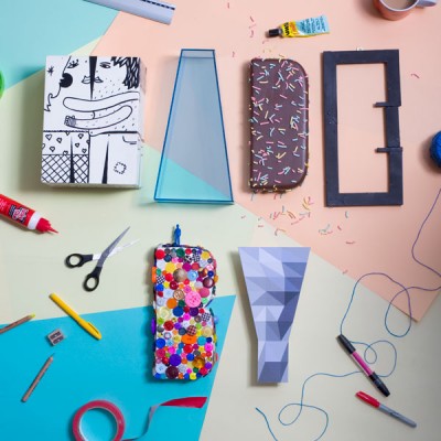
I find Alex Bec's work absolutely awesome to be honest. Its so colourful and I love how he uses card to create letters. The work he did with hands is similar to mine but it obviously uses the card to make the letters and he makes them using more than one arm compared to my one or two hands for each letter.
He posts on this website: www.itsnicethat.com


For my project the client I got was a small company. This is about as broad as a client could possibly be so I had tonnes of choice to who/what my client was. Because my message was 'Help Others', I started thinking about charity and similar things. Obviously the more well known charities aren't small companies so I couldn't use any of them. So then I thought about volunteering agencies.
Orange Rockcorps is a volunteering scheme aimed at young people, some of which fall into my target audience (style conscious 20-30 year olds). I did some research about this and thought it would be a good thing to base my client on. Therefore, I decided to make up a volunteering agency/ target audience to be my client which would be a 'small company', certainly smaller than Orange. It would specifically target style conscious 20-30 year olds and would work with a number of small charities or similar in the London area. The volunteers would get some kind of incentive similar to the Orange Rockcorps gigs.