a blog about me, my work and my influences

Showing posts with label typography. Show all posts

Thursday, 17 December 2009

poster.


This was my final poster design for the first hand in of our project. It might be changed a bit for the final hand it but I'm fairly pleased with it. The feedback included trying to display it more creatively so I'm going to think of different ways to do this.

This is the evaluation I wrote for my PDF.

"I am happy with the final layout and design of my poster. I feel it would appeal to my target audience due to the copy on it being thoughtful and the design being fairly simple and clean. The proverb I used is supposed to make the audience smile, but then also give a more thoughtful response.

"The design, I think could still be improved with more refining and experimentation with colour, layout and other things.
I think it displays the message of ‘Help Others’ in a way which isn’t too obvious but the viewer would be interested enough, because of the design and the proverb, to look at the website and see what the organisation is about. I like the fact that people have to stop and read it because it engages the person more that way and so they are perhaps more likely to follow up the poster by going to the website."

Thursday, 26 November 2009

hand alphabet.

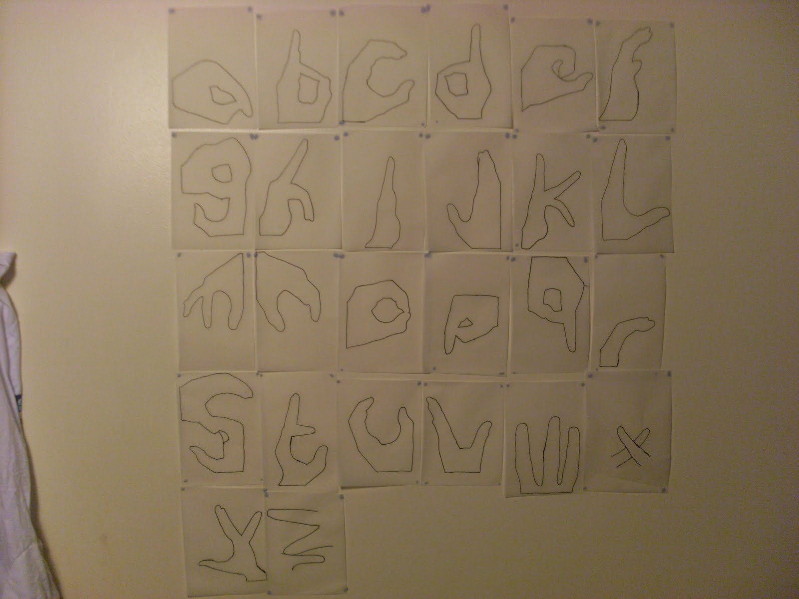
I have continued developing the 'hand' typeface, and have taken tracings of the photos to analyse the shapes more carefully. To do this, I first took a few tracings with pencil and then sketched out the hands with tone and shading.

These look good, but are far too detailed to be used on a poster or as part of a typeface.


I then traced just the outlines of each hand to simplify the letters. This gave interesting results as each hand looked more like a letter than the detailed version. I traced every hand and stuck them on my wall. The problem with these however, are that some of the letters are not easy to distiguish as a hand. So because of this I have decided to make the letters in between the two ideas, detail wise. More detailed than the outlines but less detailed than the sketches.


Monday, 23 November 2009

give me a hand.

So for my project, I've already said I looked at obvious things to do with helping others. Another obvious thing is the idea of lending a helping hand. So I've been looking at hands recently and have been looking at the shapes I can create with them. I thought it would be interesting to create an image with them or something that could be used for a poster or something similar for the final piece for my project.

When I was creating shapes, a lot of them started to look like letters so I thought it would be a interesting if I could create all the letters using my fingers. I managed to do some of the alphabet by myself but needed my girlfriends h
elp to finish the 26 letters off.

I'm thinking about using the letters I've created in a poster or set of posters to promote 'Helping Others' by using them to spell out inspirational quotes to do with helping people.

One of the problems I have with the letters however, is whether or not it will appeal to my target audience of 20-30 Style Concious People. I initially thought that perhaps the letters would appeal to children more but I'm confident that I can edit/change/manipulate the letters into something that would appeal to my audience.