These look good, but are far too detailed to be used on a poster or as part of a typeface.


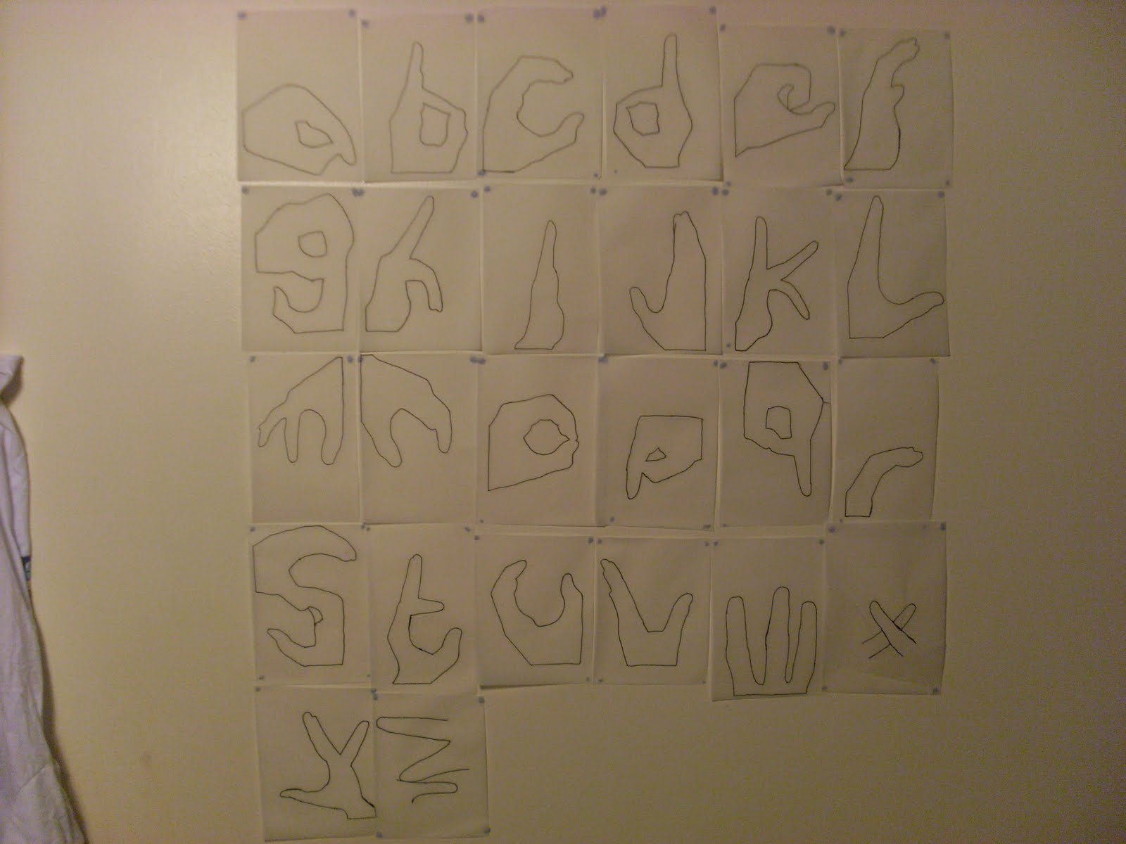
I then traced just the outlines of each hand to simplify the letters. This gave interesting results as each hand looked more like a letter than the detailed version. I traced every hand and stuck them on my wall. The problem with these however, are that some of the letters are not easy to distiguish as a hand. So because of this I have decided to make the letters in between the two ideas, detail wise. More detailed than the outlines but less detailed than the sketches.


No comments:
Post a Comment