
Friday, 27 November 2009
green eggs.
This is the book that our letterpress poster takes its copy from. The illustration on it is pretty awesome.. We were thinking about using some of the colours used on the cover (orange) or that the illustration in the book use.

letterpress.
I have begun the letterpress induction at my college. I've been to 2 sessions so far, and have 2 more to go.
The first session I got to grips the process and how to set letters and all the measurements needed. The group each had to set our names and then use the proofing press to print them. We also got given a brief to complete in the other 3 sessions.


For the brief we got separated into groups and got given a colour. Our colour was green and we had to think of a phrase or saying with the colour in. Then we have to create an A2 poster with the saying on and have to arrange the type with the different letters that they have in the workshop.
In the second session we picked our saying, 'Green Eggs and Ham', which is a book by Dr Seuss and then picked our typeface and size of the letters. Then we put these words through the proofing press and then cut them out and proofed up our poster, arranging them how we want the poster.
In the next weeks we'll do our final prints and hopefully it will look goooood...


Thursday, 26 November 2009
hand alphabet.
I have continued developing the 'hand' typeface, and have taken tracings of the photos to analyse the shapes more carefully. To do this, I first took a few tracings with pencil and then sketched out the hands with tone and shading.
These look good, but are far too detailed to be used on a poster or as part of a typeface.


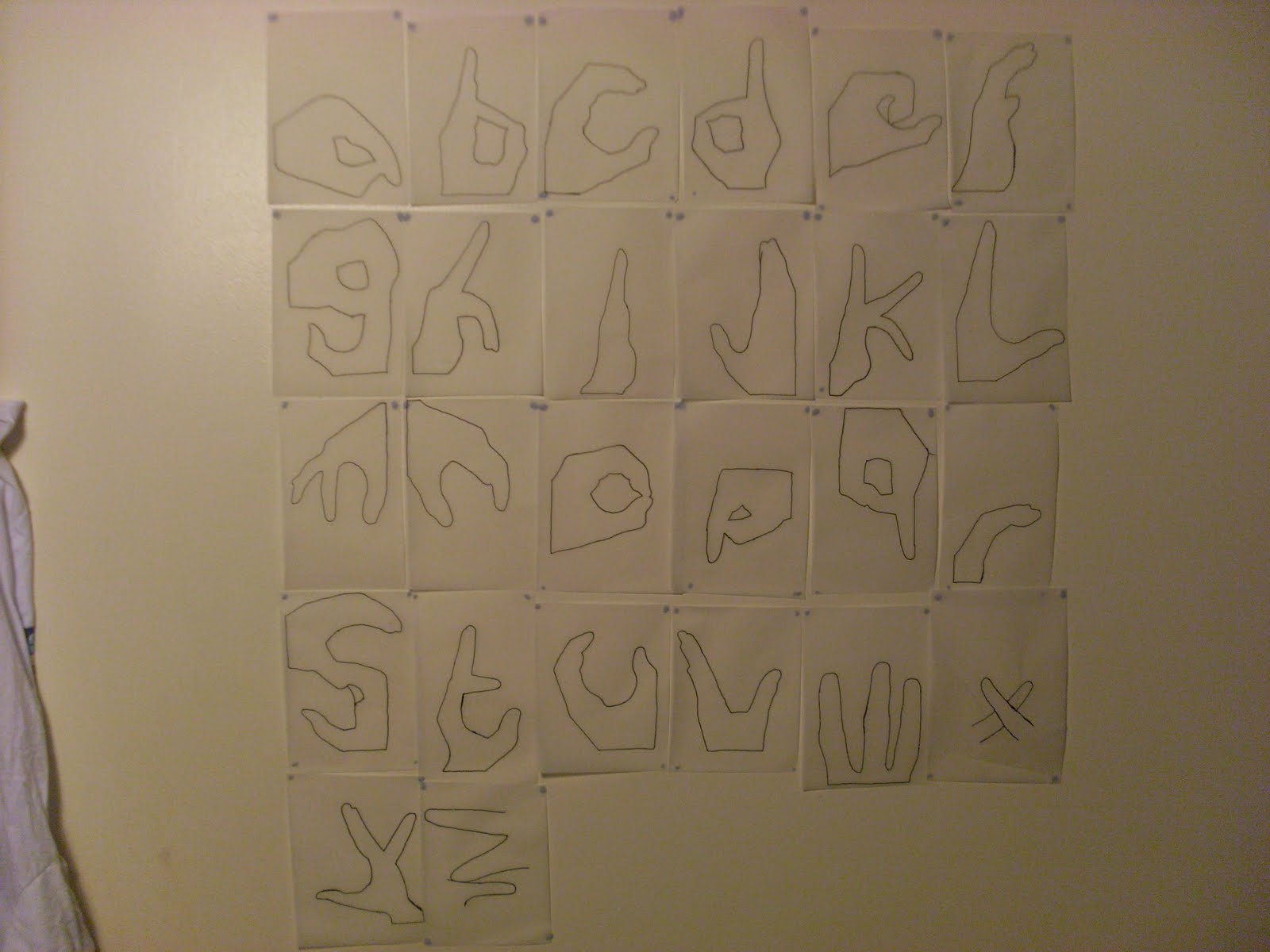
I then traced just the outlines of each hand to simplify the letters. This gave interesting results as each hand looked more like a letter than the detailed version. I traced every hand and stuck them on my wall. The problem with these however, are that some of the letters are not easy to distiguish as a hand. So because of this I have decided to make the letters in between the two ideas, detail wise. More detailed than the outlines but less detailed than the sketches.


These look good, but are far too detailed to be used on a poster or as part of a typeface.


I then traced just the outlines of each hand to simplify the letters. This gave interesting results as each hand looked more like a letter than the detailed version. I traced every hand and stuck them on my wall. The problem with these however, are that some of the letters are not easy to distiguish as a hand. So because of this I have decided to make the letters in between the two ideas, detail wise. More detailed than the outlines but less detailed than the sketches.

Monday, 23 November 2009
give me a hand.
So for my project, I've already said I looked at obvious things to do with helping others. Another obvious thing is the idea of lending a helping hand. So I've been looking at hands recently and have been looking at the shapes I can create with them. I thought it would be interesting to create an image with them or something that could be used for a poster or something similar for the final piece for my project.
When I was creating shapes, a lot of them started to look like letters so I thought it would be a interesting if I could create all the letters using my fingers. I managed to do some of the alphabet by myself but needed my girlfriends help to finish the 26 letters off.
I'm thinking about using the letters I've created in a poster or set of posters to promote 'Helping Others' by using them to spell out inspirational quotes to do with helping people.
One of the problems I have with the letters however, is whether or not it will appeal to my target audience of 20-30 Style Concious People. I initially thought that perhaps the letters would appeal to children more but I'm confident that I can edit/change/manipulate the letters into something that would appeal to my audience.


blog.
Changed the layout and colours of the blog, I think it looks much cleaner now..
I'm gonna create a banner for the top of it soon and I might play around with the HTML to make it look better sometime.
:) x
I'm gonna create a banner for the top of it soon and I might play around with the HTML to make it look better sometime.
:) x
spin.
'Twas the week before last and there was a lecture on at the LCC as part of the Talking Graphics thangg (series of lectures). I decided to pop along and there were two guys from Spin giving the talk. They talked about how they went about answering the brief from clients and showed some work which was great, polished professional stuff, and then they talked about and showed how their ideas and designs evolved throughout the design process. This was probably the most interesting part of the lecture as most people don't get to see this work and it was good to see how this process works in a real life situation.
The talk was a real valuable insight into real life graphic design. It made me more interested than ever to start working in a real design studio, they seemed like they had fun doing what they do and had a good team vibe to share ideas and thoughts with. Some of the work they showed is below.


The talk was a real valuable insight into real life graphic design. It made me more interested than ever to start working in a real design studio, they seemed like they had fun doing what they do and had a good team vibe to share ideas and thoughts with. Some of the work they showed is below.

Saturday, 21 November 2009
Sunday, 15 November 2009
tate.
A couple of weeks back I went to look around the Tate Modern for a few hours as it's free and I'm a design student. It was the first time I'd been and it was pretty good. There was some proper weird shit in there too mind, but some of the stuff was impressive.
There was an exhibition on called No Ghost Just a Shell which was a collaborative exhibition centred around the manga character Ann Lee. I'm not exactly into manga but there was some posters in the exhibition which caught my eye as good pieces of design. Unfortunately I only found one of them on the internet and it's probably the weakest one but you'll get the general idea and it's still pretty decent. I like the black and white of it contrasting with the Shell logo, it works well. There were 3 poster style pieces in the exhibition and they fitted nicely together on the same wall.

There was a Futurist painting by David Bomberg which I thought was really nice called The Mud Bath. I love the shapes and how they look 3D and create human like figures. The colours on the painting work well together and are commonly used in Futurist's work.

There was also a whole room dedicated to Russian propaganda work by people such as Rodchenko and Popova which looked fairly epic and created a sense of scale when the entire room was covered in these posters. It would be interesting to see if I could get pieces to make collages which look similar to this work because some of them looked collaged.

Saturday, 14 November 2009
SUPERHEROES.
I did some research work today on the message for my project, 'Help Others'. I thought about the most obvious things to do with helping others and thought about the types of people who might. And the most obvious people I thought of were super heroes. I thought that I could maybe use the idea of super heroes in my piece but I'm not sure yet.
I'm still thinking of ideas, so I might not use this but it's helpful to have if I decide to use a superhero. I thought listing and getting pictures of them might have started an idea, and I'm thinking of how to use perhaps one of their powers as a slogan or a design.
However I think that super heroes might appeal to a different target audience more, such as teenagers, so I'm not sure whether to further this idea.

Friday, 13 November 2009
fireworks.


Last weekend I went to Canterbury and watched some fireworks. Fireworks are pretty.
Some of these photos were taken by me, some were taken by my girlfriend. xx
Tuesday, 10 November 2009
project.
Today we got given our brief for the first proper project on my course. Although we had some say in it.. There were 6 clients, 6 messages to communicate and 6 target audiences, and I had to roll 3 dice to see which of the 6 things I had. I rolled a six, a two and a four which meant:
My client was a Small Company.
The message was 'Help Others.'
And the target audience were Style Conscious 20 - 30 year olds.
This was an interesting way of receiving a brief because it meant that it was completely random and, in a way, it's similar to working in real life because any type fo brief could be given to you. I'm not too unhappy with my dice rolls, it isn't as random and hard as some of the combinations coould have been so I'm happy about that. It'll be interesting to see what it turns out like.
After getting the brief we got sent away for a couple of hours to produce something visual which was kind of like our first take on the brief. I decided to pick one of the 3 main points, (client, message, audience), and produce something on one of them. I had my camera with me, so wanted to use that to record something on one of the points and thought that the LCC is full of stylish people so decided to pick the target audience.
I thought about the things a 'style conscious' person might care about and, other than their clothes, I thought their hair was usually of great importance. So, on the way to grab some lunch, I stealthily took photos of peoples hair if they looked like they took a lot of effort to make it look good.
After that I found a computer and found some more 'cool' hair styles and images relating to hair and hair styling and, because I'm in collage-mode at the moment, decided to make a collage to do with hair styles of perhaps my target audience. I felt I needed some text with the collage so went with the simple but effective, 'these stylish motherfuckers are my target audience'. Then I stuck it on a bit of cardboard which was lying about and you can see it below. YAY.


glug.
I recently attended a night where designers go to basically get pissed and do some networking. Although the slogan for the night is "More no working than networking". They had a bunch of street art there and 2 illustrators did a cool installation in a room there, where they put up their work and drew on the walls and stuff. I got to meet the 2 guys who did it which was cool.
John Slade Ian Stevenson


John Slade Ian Stevenson


Monday, 9 November 2009
bread roll.


I've been on a bit of a roll today with my collages, been impressed with myself! I seem to mess up my bed everytime I make them though.. It's more comfy than sitting at a desk.
They're getting on alright now, I'm trying to keep them simple, with WHITE SPACE like we got told in the workshop. Once I get into a flow, all the cutting and sticking comes naturally really. I'm finding it hard to make them for some of the groups though, I'm not really thinking about them when I make the collages but I try and fit them into the catorgories afterwards. Got piles all laid out on my floor.. It's a mess.
simon evans.


Found this piece by Simon Evans called Everything I Have. It's basically photos of everything he owns arranged in groups like clothing, food etc. and also arranged in colour groups. It creates an interesting piece visually and also reminds me of the research workshop I did a couple of weeks back for my course.
In the workshop we learnt about different ways of visualising and presenting our research and data we collected for it. This piece by Simon Evans looks like something like that, it is a more interesting way of showing everything he has than a list.
You can view more of his work here.
Wednesday, 4 November 2009
more collage photos.


A couple more pictues of mess created by me making collages. I'm trying to do mine one catorgory at a time, i.e. Composition. Its going pretty well, cutting stuff out of magazines and sticking it down nicely.. planning on getting a few more done today. Better get cracking. xx
george.


Meet George. He had a tough beginning to his life, getting his brains ripped out, and now hes looking a little shrivelled and worse for wear. But he had a good night at Halloween, serving his purpose. I though he looked pretty good.
RIP George.
Monday, 2 November 2009
posties.
These are some of the collages I made in the Image workshop. It was a couple of weeks ago now but nevermind..


Subscribe to:
Comments (Atom)
